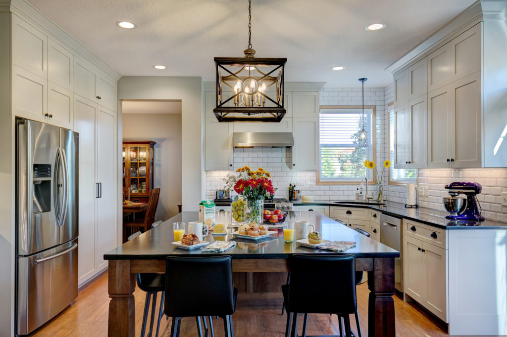
If we could use one word to describe this remodel it would definitely be transformation. Through thoughtful design and strategic improvements, this space truly went from ordinary to extraordinary. Originally comprised of early 2000’s builder’s grade materials, this kitchen was due for a makeover. Lovers of craftsmen-style design, the clients wanted to give the room an image overhaul. Their main goals were to expand the center island and increase storage for their collection of pots and pans.
Designer, Christine, crafted her plans for the room around the island. It was the star of the show, the true focal point! To save a bit on expenses, the clients decided to retain the original laminate flooring and maple millwork. The cabinets were painted a cool, gray color to contrast against all of the room’s warm wood tones.
Another huge goal for this project was to make the space brighter. The before pictures below show a room that’s dearly in need of light! We remedied this issue by adding high-powered LED lights wherever we could, along with playful accent lighting. Other significant upgrades included oversized cutlery drawers, baking pan storage, a charging station, and a trash pullout drawer.
The finished kitchen is a breath of fresh air! Open and bright, it’s now a distinctly welcoming space. It was a true pleasure collaborating with these lovely clients, and we’re incredibly proud of how this project turned out.


